
andrea designs
Brand Identity
About the project: A fellow designer, Andrea Williams knew she needed to update her own brand, but decided she wanted an outside perspective rather than do it herself. Also the owner of Paisley Paper, her freelance clientele had grown to reflect her own ethos and interests, and her clients were seeking her out specifically.
Because of that, it seemed necessary not only to inject a bit more personality into her brand (while still keeping things simple for versatility), but to celebrate it. And given the success of Paisley, we decided to approach her freelance business a sister brand.
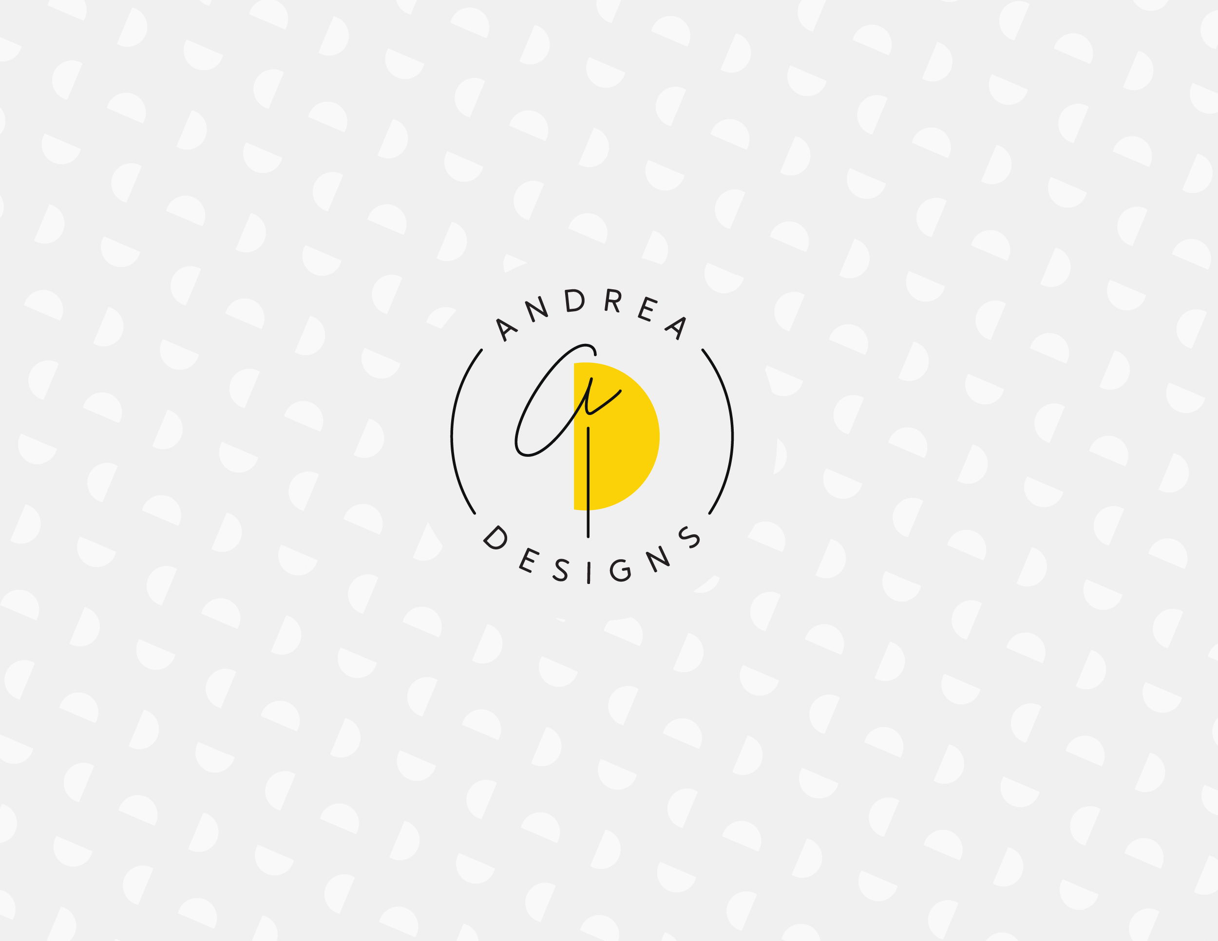
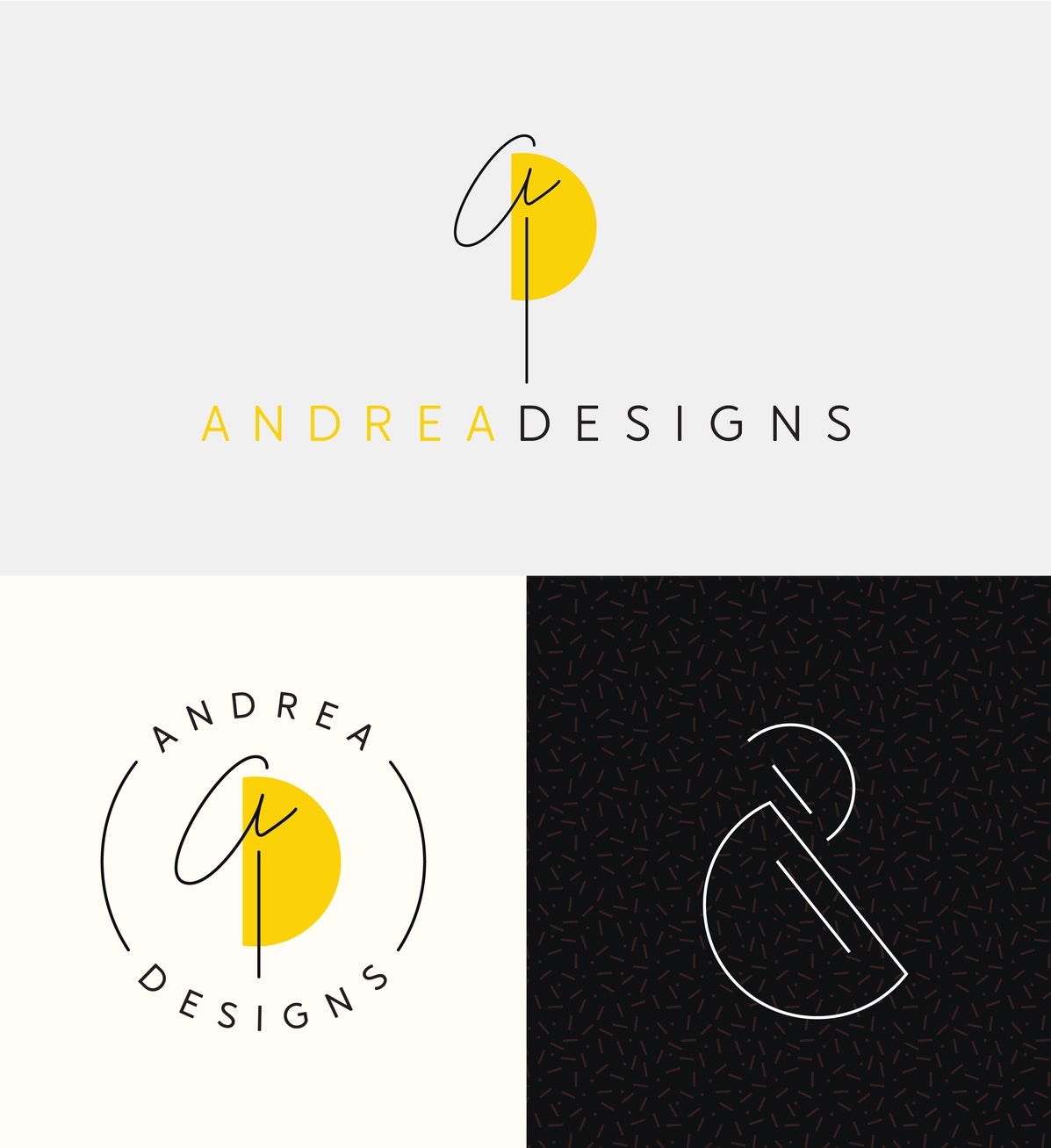
This meant incorporating the same yellow used in some of Paisley’s branding, and creating a hand-lettered script ‘A‘ to pair with the playful ‘P’ used in Paisley’s identity.
Andrea was also interested in incorporating an ampersand into the identity, and while it did not make sense for the primary logo, an abstracted ampersand form is used in some of the marks, patterns, and supporting elements in the identity, and also works as a monogram of sorts for the business name. The overall look is modern and personable with warmth and style.

Keywords: Colorful, Celebratory, Fun, Delightful, Professional, Unexpected, Artful, Well Crafted, Expansive